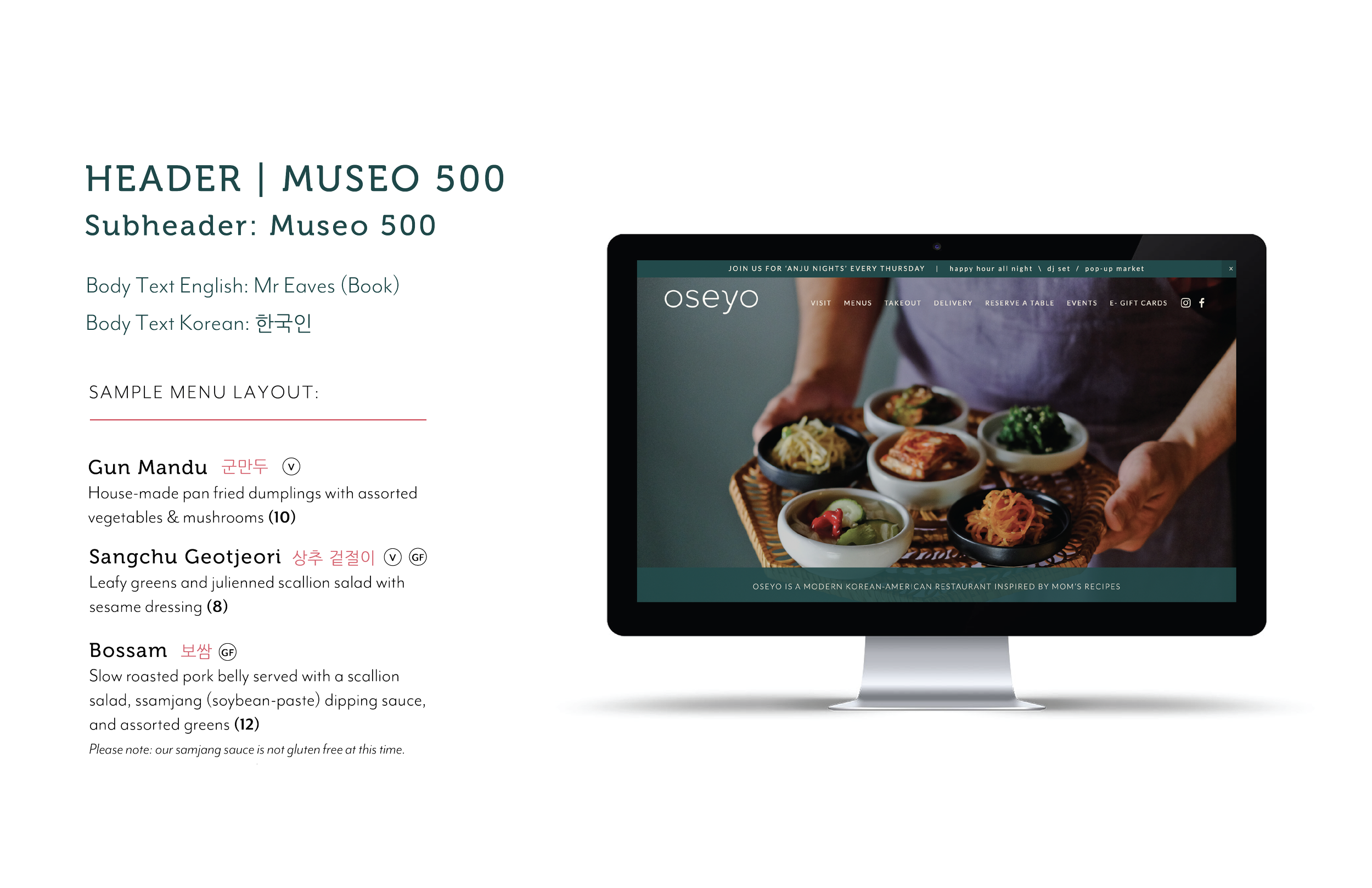
Oseyo is a modern Korean-American restaurant inspired by mom’s recipes.
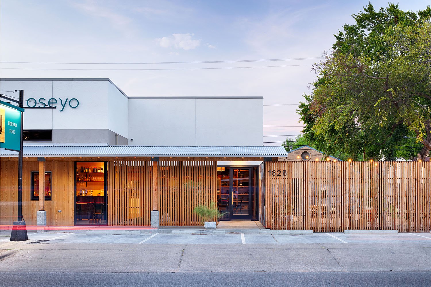
Oseyo is located on Austin’s hip Eastside, serving traditional food in rustic interiors with a lively bar. The brand was inspired by taking traditional Korean patterns & colors, and using them in a more playful and sleek way.
MY ROLE:
BRAND STRATEGY • IDENTITY • PACKAGING • MENU • SIGNAGE • MERCHANDISE

THE OBJECTIVE
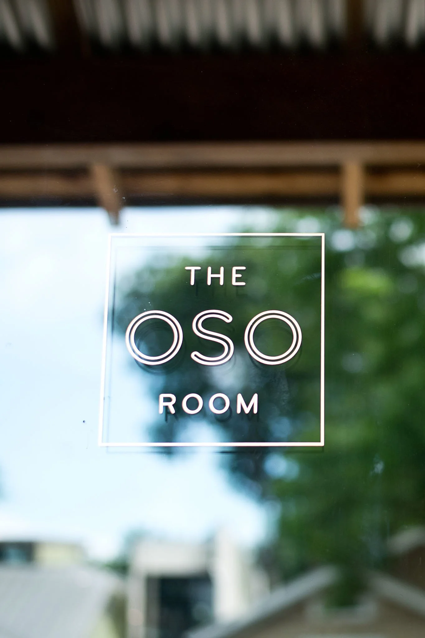
“Oso Oseyo” is an expression used to say “Welcome to my home” in Korean, and this was the launchpad for the restaurant’s brand - to create a restaurant experience that is laid back, playful, and welcoming. The creative scope included brand identity, menu design, and custom merchandise. I was also asked to create a secondary logo for the Oso Room - a private dining space and event hall attached to the restaurant.
IDENTITY STRATEGY
Oseyo’s main logotype is soft & simple with a playful slant, reflecting the easygoing & inviting spirit of the restaurant. The icon is inspired by the dojang, a personal seal used as a signature in Korea. It’s composed of a stylized version of the Hangul characters that spell “Oseyo”, and incorporates a stamp texture whenever possible.
Oseyo’s brand identity was built on taking traditional elements and adding a modern flair. The color palette is classic to Korea - yellow, blue, and red all have cultural significance, while the intricate brand pattern was inspired by historic geometric textile patterns.


